Beneath the Surface
Structuring informational content and downloadable resources to call users to action

Duration
& Outcome
2 years 3 mos
Built and shipped >>
Team
1 PM
3 Designers
3 Media Specialists
2 Researchers
4 Developers
My Role
Product Designer
Toolkit
Figma
Adobe Creative Suite
Asana
Slack
Location
Tokyo, Japan
Remote
Context & Background
Problem
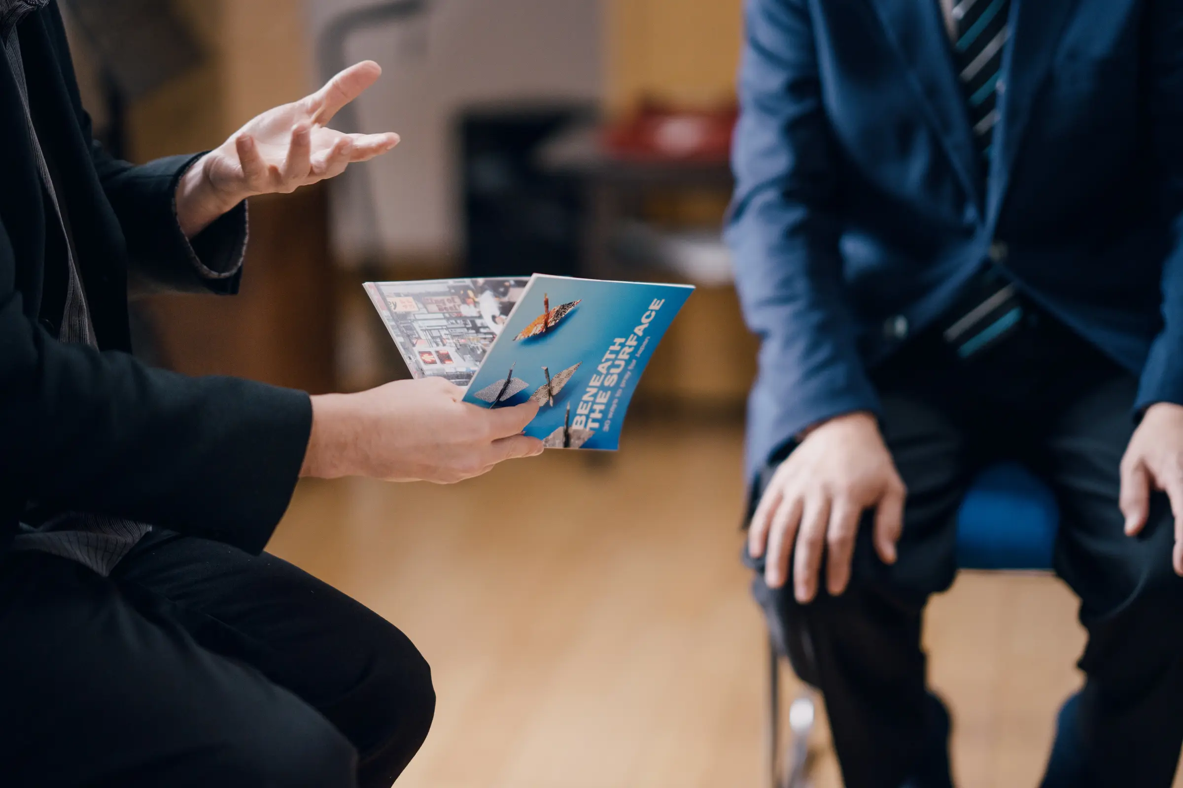
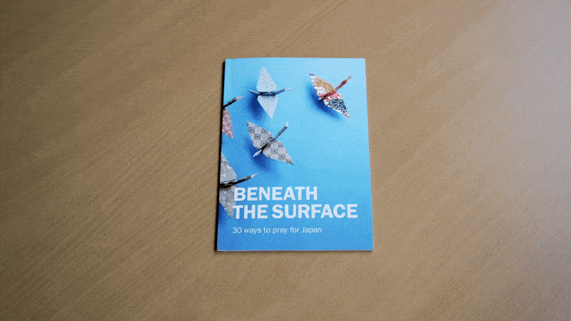
Existing content for Beneath the Surface, a prayer guide about Japan’s Christian history, lacked a clear, accessible, digital platform for global audiences.
Existing content for Beneath the Surface, a prayer guide about Japan’s Christian history, lacked a clear, accessible, digital platform for global audiences.
📖
Difficult to distribute content and resources to all interested users through current decentralized and mainly print system.
😕
🎨
Absence of a comprehensive design system and need for a brand refresh.
⚠️ Challenge
How might we inform users, connect with them, and motivate them to download and share content with their communities?
User research
Methods
Interviewed content providers and researchers to get a sense of organizational needs.
Identified possible user groups of varying ages and verbally surveyed them to learn about user satisfaction with comparators and Beneath the Surface’s current print resource.

Existing content for Beneath the Surface, a prayer guide about Japan’s Christian history, lacked a clear, accessible, digital platform for global audiences.
User insights
Wanted credibility, a neutral stance, and an empathetic tone
Sought simple, actionable steps and clear points
Wanted to understand the context (history, struggles, progress)
Stakeholder insights
Design solutions
After synthesizing the insights from interviews, surveys, and competitive analysis, our team established the key features to design for our MVP and identified future features to design with scalability in mind.
Key Features
1️⃣
Engaging content pages promoting learning and calling users to action

mobile web
desktop web
2️⃣
Categories and topic pages simplifying complex historical context to be digestible and compelling, but also trustworthy and respectful of nuances.

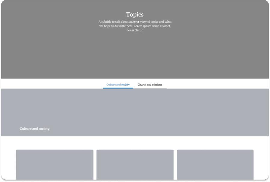
mobile web
desktop web
3️⃣
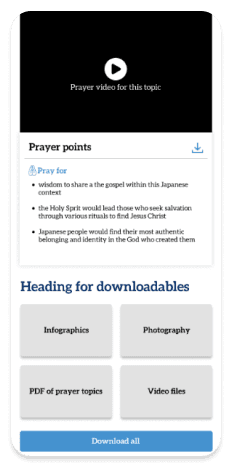
Accessible downloadable informational resources
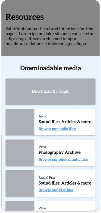
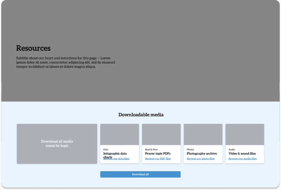
mobile web
desktop web
4️⃣
Purchase page for the physical book
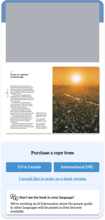

mobile web
desktop web
5️⃣
Compatible with translating to Japanese
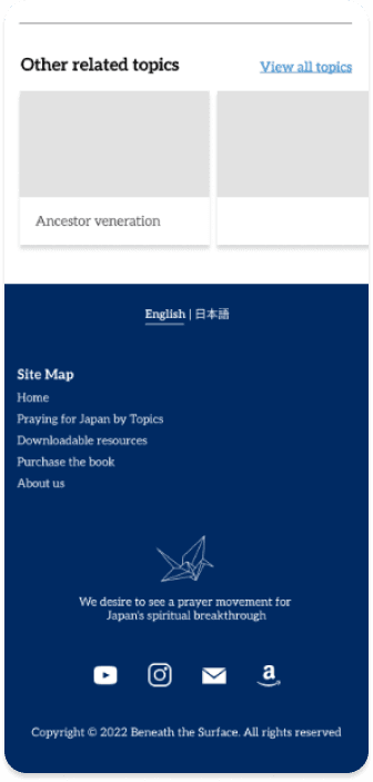
mobile web
desktop web
Upcoming Features
Virtual informational walks through Japanese regions
Future content topics
Design system
Visual design & branding
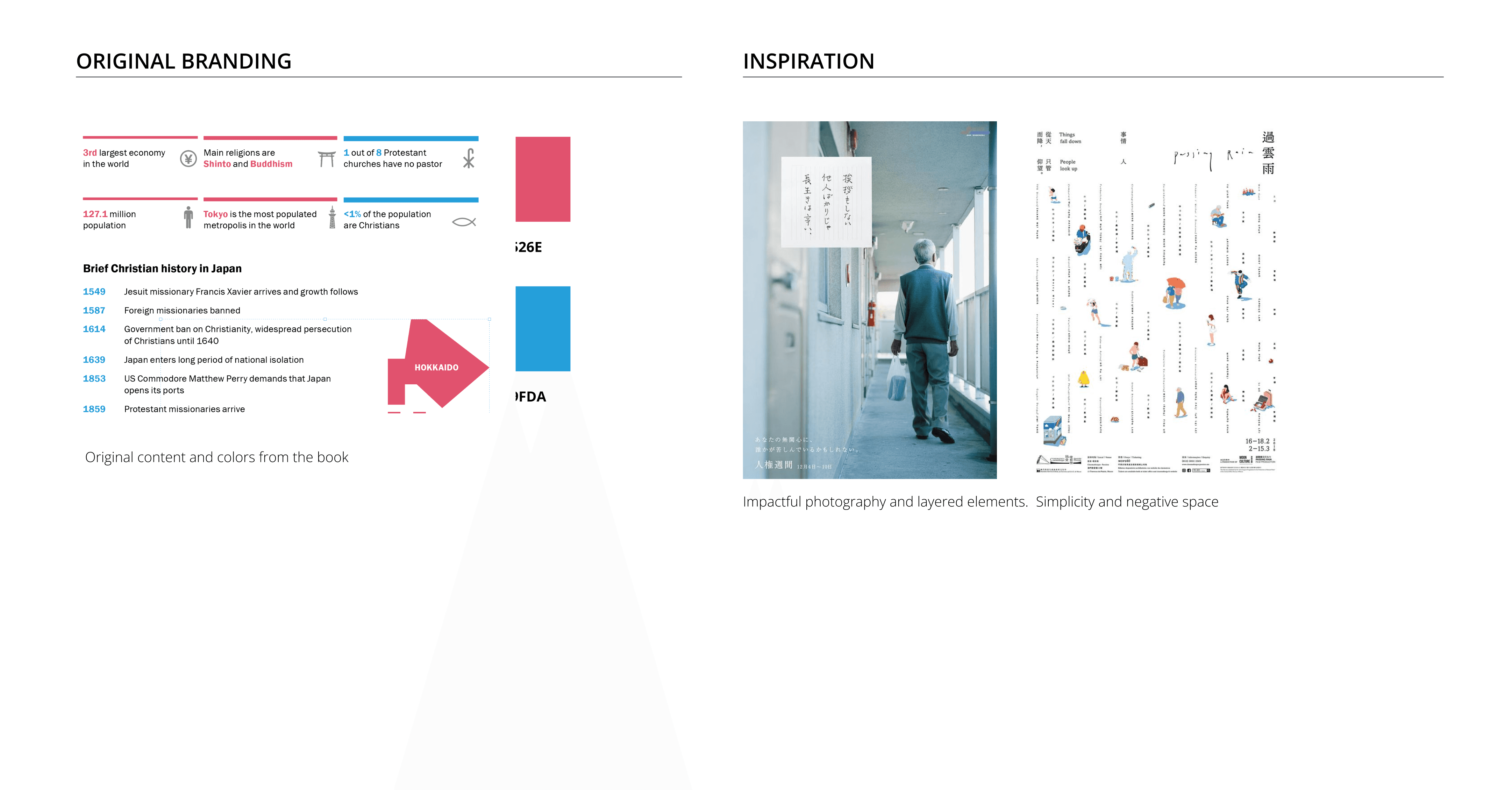
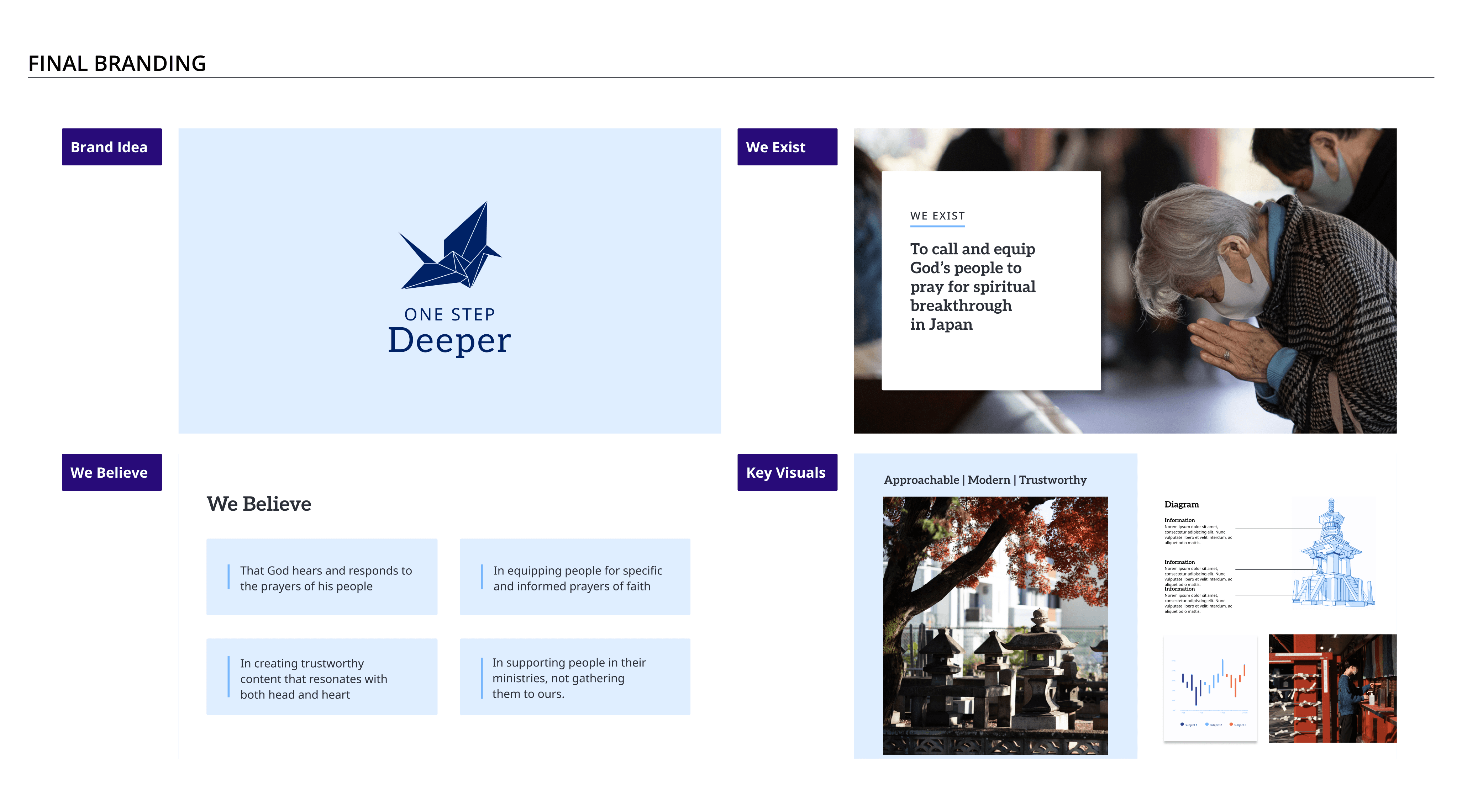
Our primary goal was to have the website be an evolution of the original branding of the book. A focal point was moving the site’s branding to be more modern and approachable while also keeping a level of professionalism and credibility.
Key points
Warm, inviting,
and approachable
Modern, and visually cohesive with both western and
Japanese aesthetics.
Lorem Ipsum
assets & component library
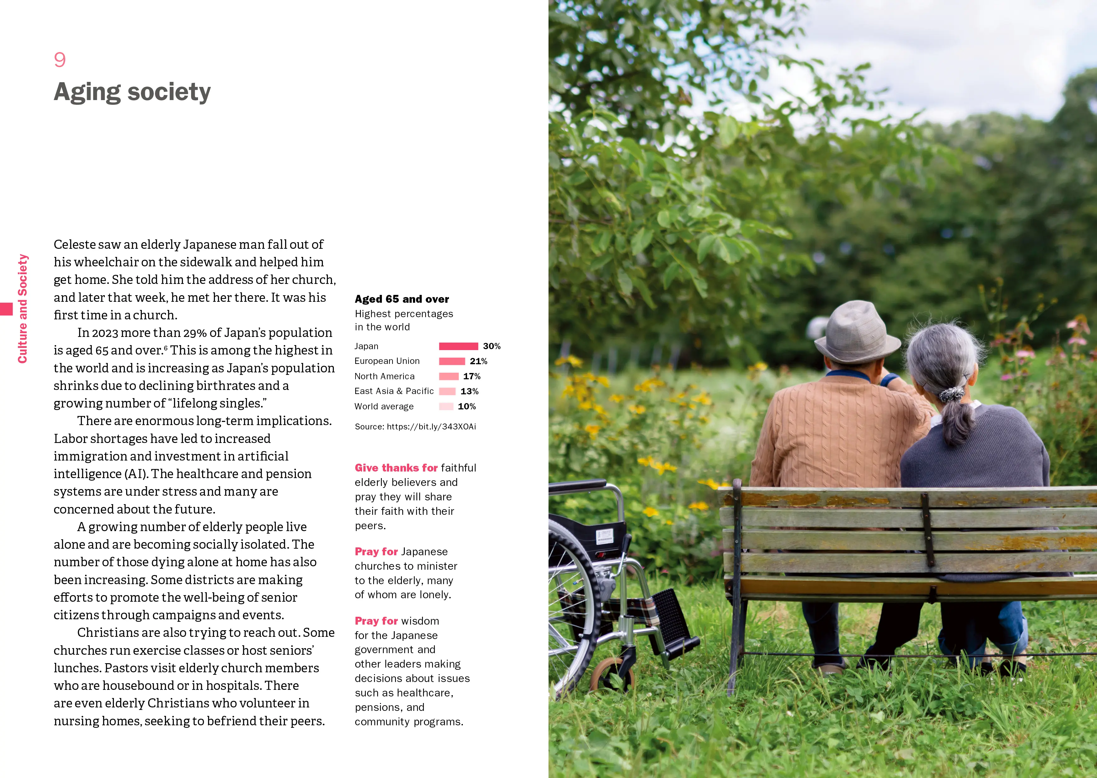
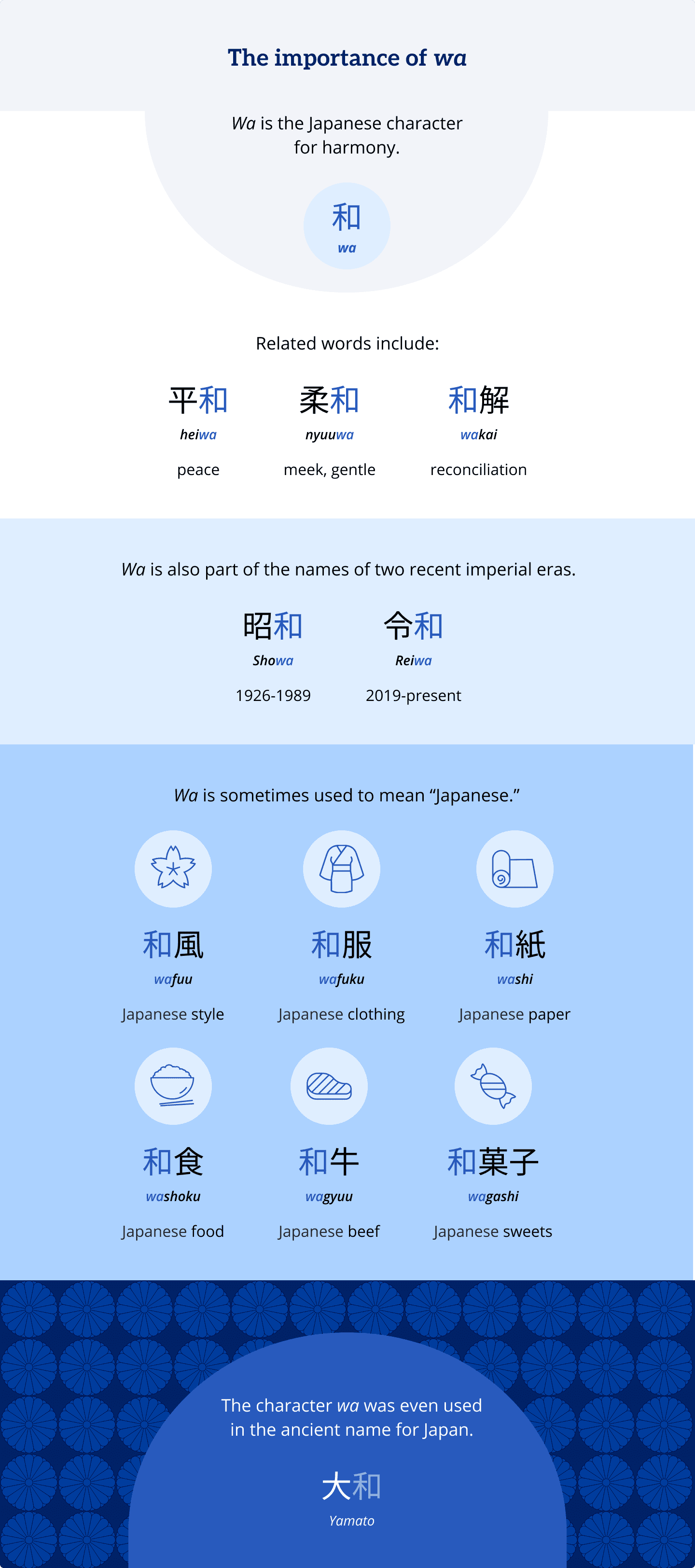
I documented and organized design decisions into specific components on a shared Figma library. These visual design guidelines were used not only to build out web pages, but also to create stylistically consistent infographics formatted for all breakpoints, across our team of designers. A select few of the infographics I designed are showcased below!
Figma component library

infographics


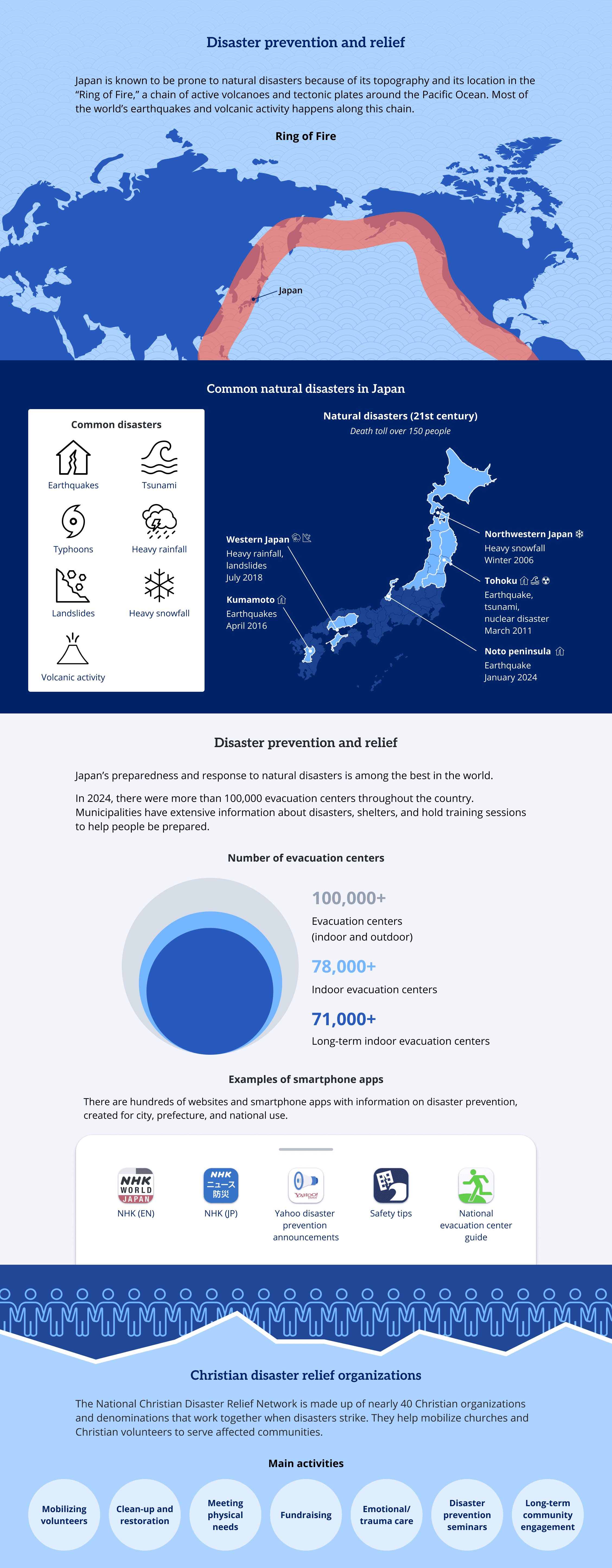
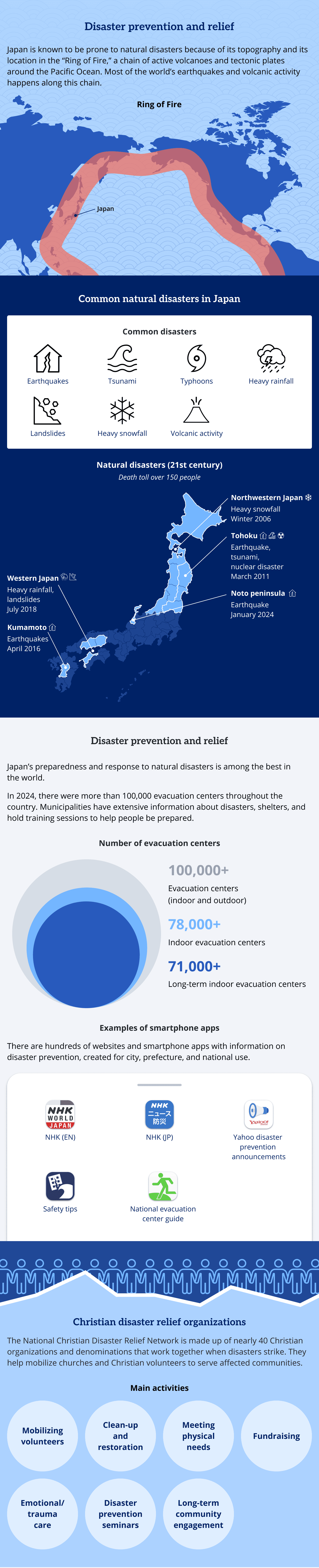

Our component library was used to create blocks and templates to further ensure consistency across 30+ content pages and downloadable resources. This system also allowed for future-proofing so that should more topics be added or modified, the structure and visual consistency of the site would be maintained.
✅
Streamlined the building process for the development team
✅
✅
Evolved brand identity and visual consistency across print and web resources
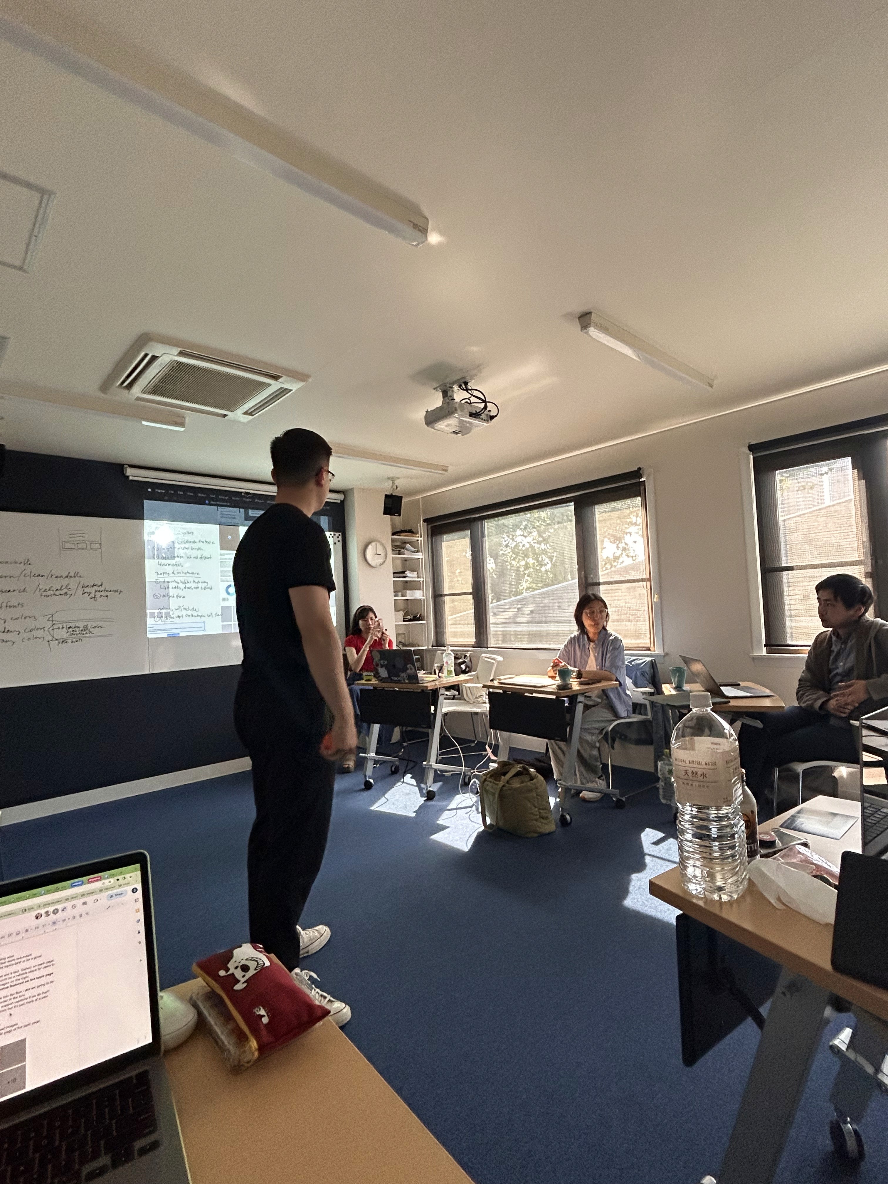
Feedback & iteration
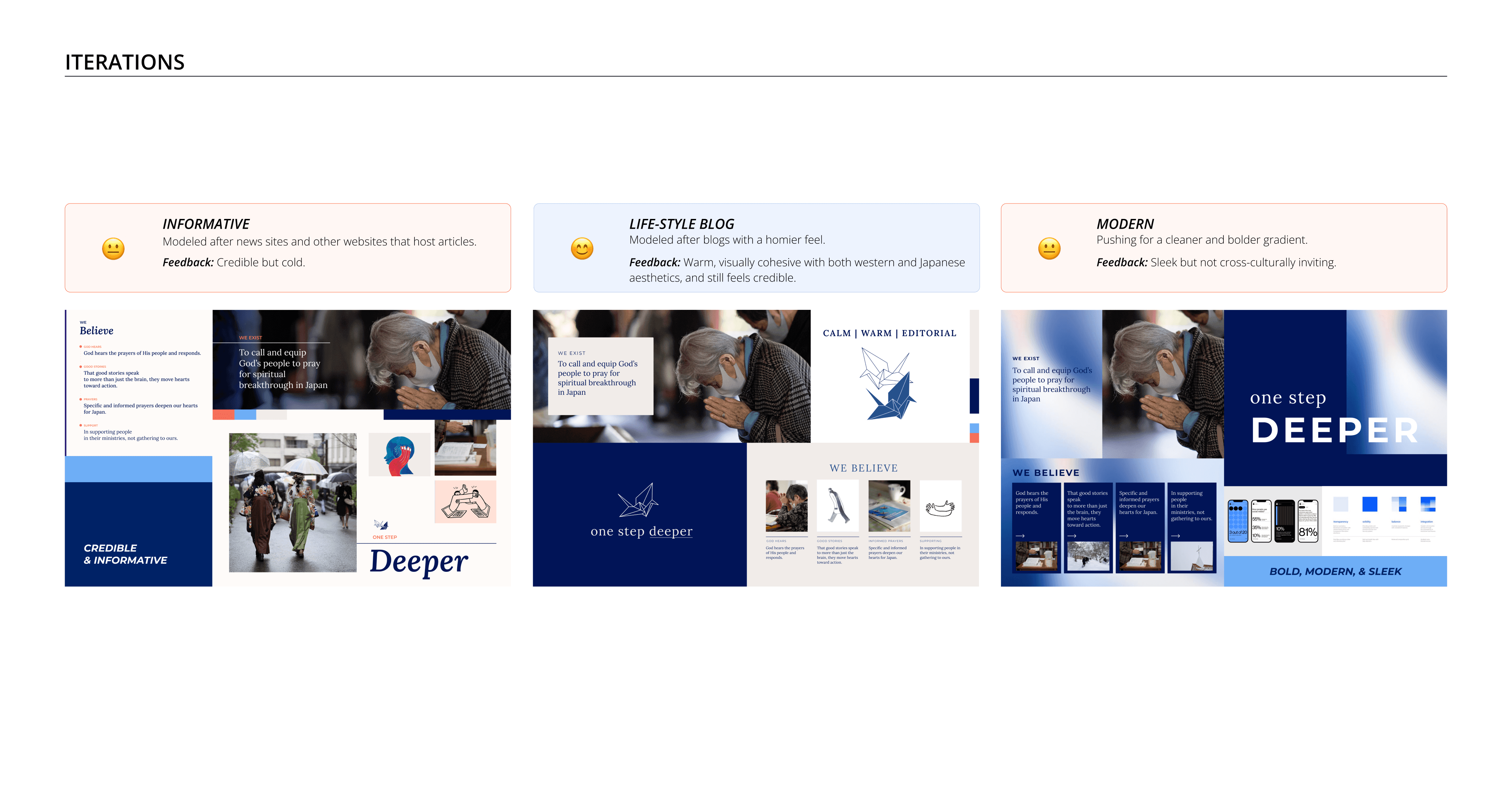
We went through several rounds of internal feedback and iteration in order to refine our MVP to accommodate for our team's limitations and project timeline. In this case study, I'm showcasing our 'Home' page where we sought feedback focused on refining our mobile prototype layouts to streamline the user experience and direct users primarily to the 'Topics' page, with a secondary user flow to learning more about the website as a whole and offering a section to purchase the book the website expands upon.
Home page – Topics Button
There were several rounds of iteration to finalize the home page layout and find how to best direct users to navigate to the 'Topics' page and access all other content and resources. We wanted users to have easy access, but also to reduce repetitive and redundant buttons to simplify user experience.

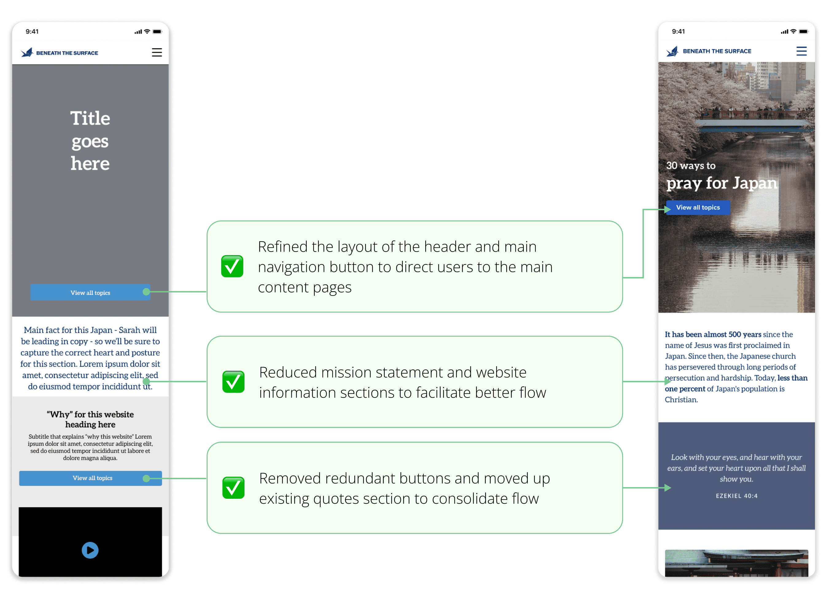
Home page – purchasing Section
We redesigned this section several times, at first wanting to keep this section as concise as possible, associating less space with a simpler user experience. This made this section feel cramped and frustrating for users who had to click through many pages to order a booklet to their specific location. We found that expanding this section and giving each interaction its own button clarified and streamlined the purchasing process.

take-aways
Carefully evaluating and removing redundant/repetitive interactions
Emphasize key calls to action with button color and placement
Clarity, not simply concision, streamlines user experience
outcomes
This site is live! Please take a look here!
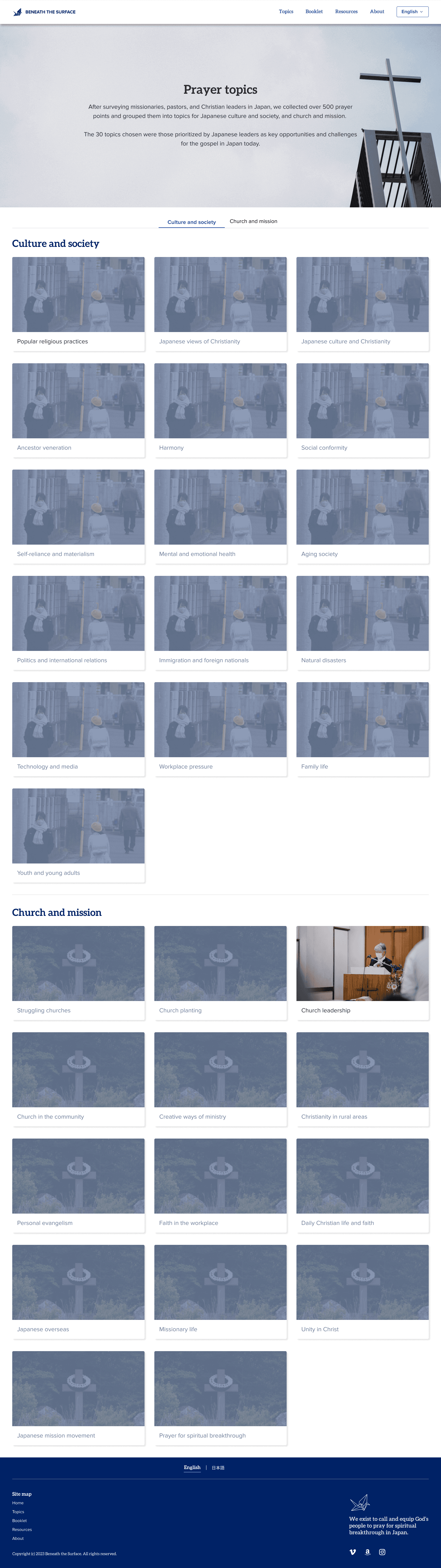
Below, I've showcased final designs of four main pages users navigate to.
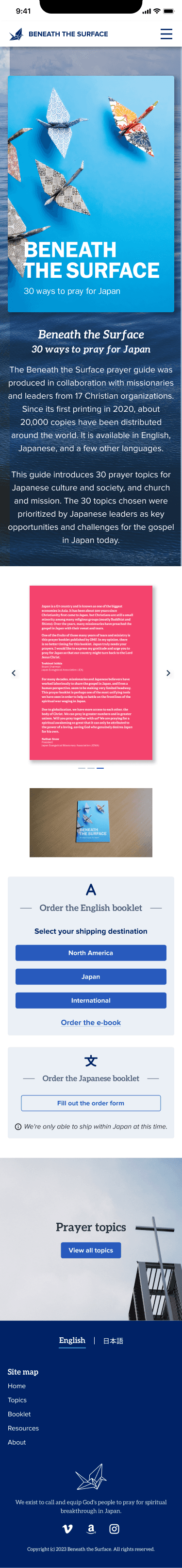
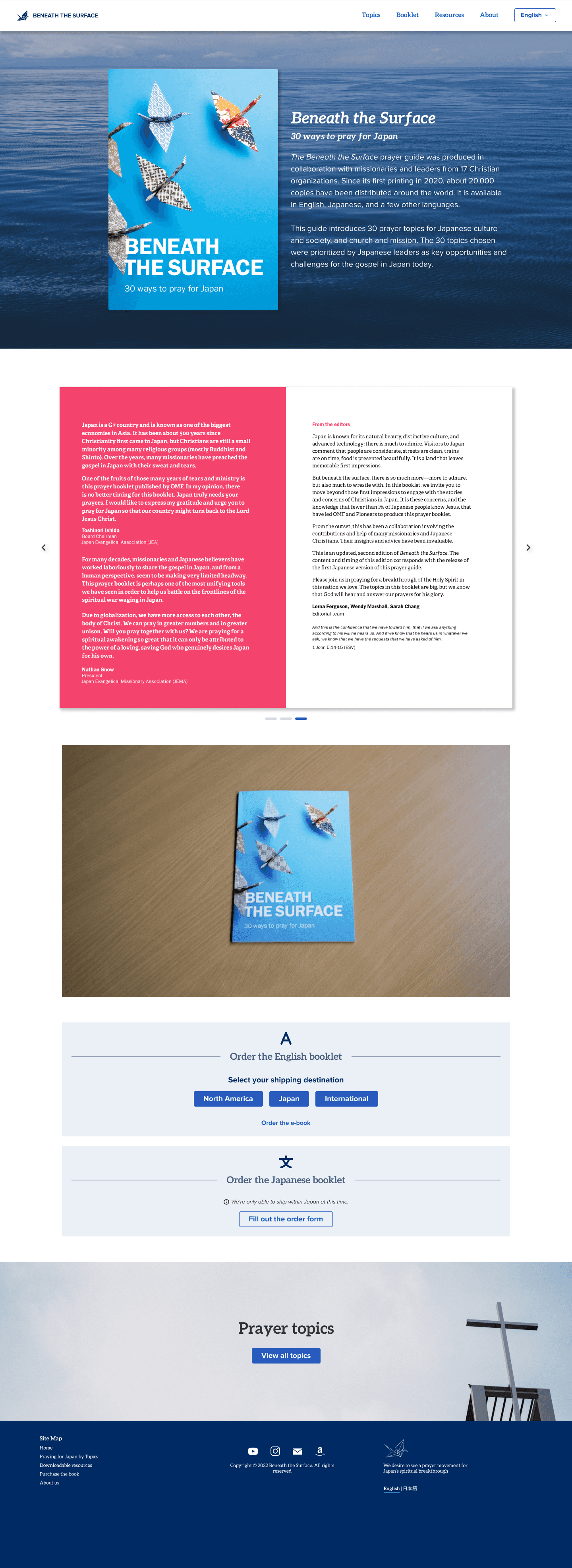
Home page


Topics page

Content page


Purchasing page
Final reflections
This was my first time working with a larger design team, as well as my first time developing a brand identity and design system. I loved learning from experienced mentors on the team on how to document design decisions and ensure visual consistency across all assets, and working together not only with other designers, but across our team of researchers, developers, and media specialists. It was a pleasure working on this project both on location in Japan and remotely!
next steps
👩🏻💻
Collecting and analyzing feedback from users to identify points for improvement
🪄
Planning and designing future features using existing design components
🇯🇵
Translating the site and all content into Japanese and other languages
Sharon Kim 2025